Got the little sign above at http://www.churchsigngenerator.com/
We had another comment by a visitor at our Easter services regarding our church sign. The person said they were "often blessed by its message". Which got Pastor Poppe and I to talking, about the many similar comments we have heard since we got our new sign in 2000.

But one thing we have kept in mind as we choose the weekly sign message is to avoid being "cutesy".
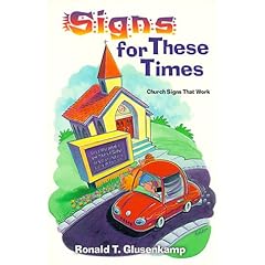
This book seems to be the bible of church signs for many churches. It's where they get all those "catchy" and "clever" messages about
"Avoid Truth Decay"
and
"God Answers Knee-Mail"
and
"C H _ R C H - The only thing missing is U".
Put aside the fact that after you've seen one of these humorous messages once, it's old hat on the next church sign. Thus, what is intended to be clever and creative becomes just another church following the same tired trick...
My thought has been that a church sign like ours is a wonderful place to post a short weekly message from the actual word of God. What a novel thought!
Now, usually there's no punchline. Especially in a smaller sign such as ours, the message must be of limited length. We don't even post the book and chapter, usually... just the key phrase of the week. Occasionally a sermon theme or title, but since we preach textual sermons that's usually not too far from the scripture text anyway. Like:
"Christ is Risen"
"Hosanna"
"My Sheep Hear My Voice"
"Son, Your Sins Are Forgiven"
"Christ Our Sabbath Rest"
We also try to make our short messages less moral guidance and more of God's promises in Christ.
Admittedly, we occasionally veer from this to announce a special event or service being offered. Sometimes the message is a little cryptic, intended to pique some curiosity.
But I find it ironic that so many churches take a page here from the book of "Church Growth" thinking, in an effort to be unique and clever, and really do just the opposite. Instead of trying to be cutesy, or relying on a book of "clever" one-liners, why not rely on THE book, and let God's Word be your face to the world?


4 comments:
A church in my neighborhood just got a new scrolling church sign. Now they can post messages that are as long as they are banal.
http://www.signsplussigns.com/church-signs/LedsignPages/Which%20LED.htm
I actually don't as much of a problem with the type of sign as the message posted on it.
That's in principle, though, since I think many of these signs are just tacky.
We have a scrolling sign out front of our church. We also tend to display a bible verse each week or something that will point to one. It is interesting because we are on a college campus and are often even known as the "church with the red scrolling sign" when describing where it is.
Theres another church sign generator on www.signgenerator.org.
Post a Comment